AI Isn't Killing Typography—It's Exposing How We Stopped Caring About Being Addressed
There is something quietly political about choosing a typeface. It says: I thought about how this would arrive. Gotham Variable arrived this month, and almost nobody noticed. Perhaps that is the most interesting thing about it.

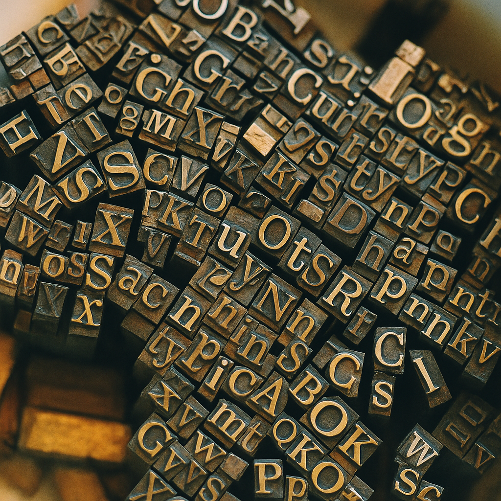
There is a particular kind of intimacy in handwriting a friend's name. The slope of the letters, the loop you give the y, whether your t leans forward like it's eager or stands upright like it's been to finishing school, these are small declarations of feeling. Typography, when you look at it closely, has always been a love language. We stopped calling it that around the time we started typing.
I have been thinking about this since Monotype quietly released Gotham Variable in May, the kind of design event that does not trend but probably should. Gotham, for the uninitiated, is the typeface primarily designed by Tobias Frere-Jones in 2000, drawn from the muscular vernacular signage of New York City, the Port Authority Bus Terminal, the cornerstones of mid-century civic buildings, the kind of lettering applied by people who were not thinking about brand identity. Someone rescued it from anonymity and gave it a name, and then it became, somehow, the official face of the early twenty-first century. Obama's 2008 campaign. Spotify. Saturday Night Live.
A variable font, technically, is a single file containing a continuum of weights and widths rather than discrete versions. You can dial Gotham from a whisper to a shout without changing typefaces. Designers get more nuance with less file size. In poetic terms, and I think typography rewards poetic terms, a letterform can now breathe. It can grow slightly heavier when it wants to be taken seriously, slightly lighter when it wants to apologize.
This matters, I think, because the way letters look has always been how we tell each other what we mean before we say it. In Japanese calligraphic tradition, the discipline of the brush is understood as inseparable from the discipline of the person, the quality of a person's writing reflects the quality of their attention. In Arabic calligraphy, the same holds: the hand and the spirit train together. Even the English word character describes both a personality and a printed letter, which is not an accident. When Type Magazine argues that typefaces like Gotham became symbols of modernity and inclusivity, what they mean, I suspect, is that a generation chose to be addressed in a specific tone of voice. Gotham is friendly without being chummy. It is confident without being loud. It is, if you'll permit the comparison, the typographic equivalent of a person who remembers your coffee order.
Which brings me to the strange, ambient anxiety of the past year or so: the question of what artificial intelligence will do to all of this. Fast Company recently surveyed the new generation of AI design tools, systems that can generate a complete brand identity, including custom typography, in roughly the time it takes to make tea. The pieces produced are technically competent. They are also, almost without exception, the visual equivalent of small talk. They have learned what a typeface looks like without learning what one is for.
I want to be careful here, because the temptation is to declare that the machines lack soul, which is the kind of thing people say when they mean they themselves are nervous. The more interesting observation is subtler: AI is exceptionally good at producing letterforms that have never been touched by a particular pair of hands in a particular city looking at a particular sign. Frere-Jones spent years walking around Manhattan with a camera. The signs he photographed were made by men whose names we mostly do not know, working in trades that mostly no longer exist. Gotham carries that lineage the way a grandchild carries a grandparent's laugh. An algorithmically generated typeface, however polished, is an orphan. This is not a moral judgment. It is a different relationship to time.
Here, somewhat unexpectedly, I find myself thinking about friendship. Dazed recently published a lovely piece about young women reframing their close friendships in the language usually reserved for romance, saying, essentially, that platonic love is allowed to be tender, declarative, ritualized. The piece connected to the typography question in a way I could not at first articulate. Then I realized: both are arguments about the dignity of forms we had stopped noticing.
A typeface carries messages between people who will never meet. The campaign poster, the museum wall text, the wedding invitation, the obituary, these are all conversations. The choice of typeface is the tone of voice we extend to strangers, and to friends, and to the public. To care about it is to care about the experience of being addressed.
In countries where the postal service is still robust, Japan's nengajo New Year cards, the elaborate stationery cultures of France and Italy, the choice of typeface or hand on an envelope is a small kindness. It signals: I thought about how this would arrive in your hands. What we have been losing, in the long migration from the desktop to the phone to the algorithmic feed, is the slow ceremony of choosing how to appear to one another. Variable fonts, in their odd technical way, are a small countercurrent. They give a designer more room to attend to the specific reader, the specific moment, the specific feeling.
The friendship parallel is not a metaphor I am imposing. It is what the design history contains. Gotham became beloved because it felt, somehow, trustworthy, like a friend who showed up early and listened. Comic Sans, on the other hand, became reviled not because it is poorly drawn (it isn't, particularly) but because it kept appearing in contexts where it had not been invited, like a guest who does not read the room. We treat typefaces the way we treat people. We grant them character, we resent their overreach, we feel addressed or ignored by them.
What I hope, in the AI era, is that we do not confuse fluency for friendship. A machine can generate a thousand serviceable typefaces by lunchtime. None of them will have walked a city. None will have been chosen by a designer who imagined a specific reader on a specific morning. The dance of type, that quiet, daily exchange between the people who shape letters and the people who read them, is older than we remember and easier to lose than we think. Worth pausing, occasionally, to notice the choreography.
References
https://www.creativebloq.com/design/fonts-typography/gotham-variable
https://fontsinuse.com/typefaces/20/gotham
https://www.dazeddigital.com/life-culture/article/70252/1/there-is-nothing-more-romantic-than-friendship-dating-platonic-love
https://www.fastcompany.com/91537044/what-new-ai-design-tools-mean-for-brand-typography-ai-brand-design-typography
Models used: gpt-4.1, claude-opus-4-7, claude-haiku-4-5-20251001, gpt-image-2
If this resonated, SouthPole is a slow newsletter about art, technology, and the old internet — written for people who still enjoy thinking in full sentences.